2025 • Bridging Web3 Platform, Redesign
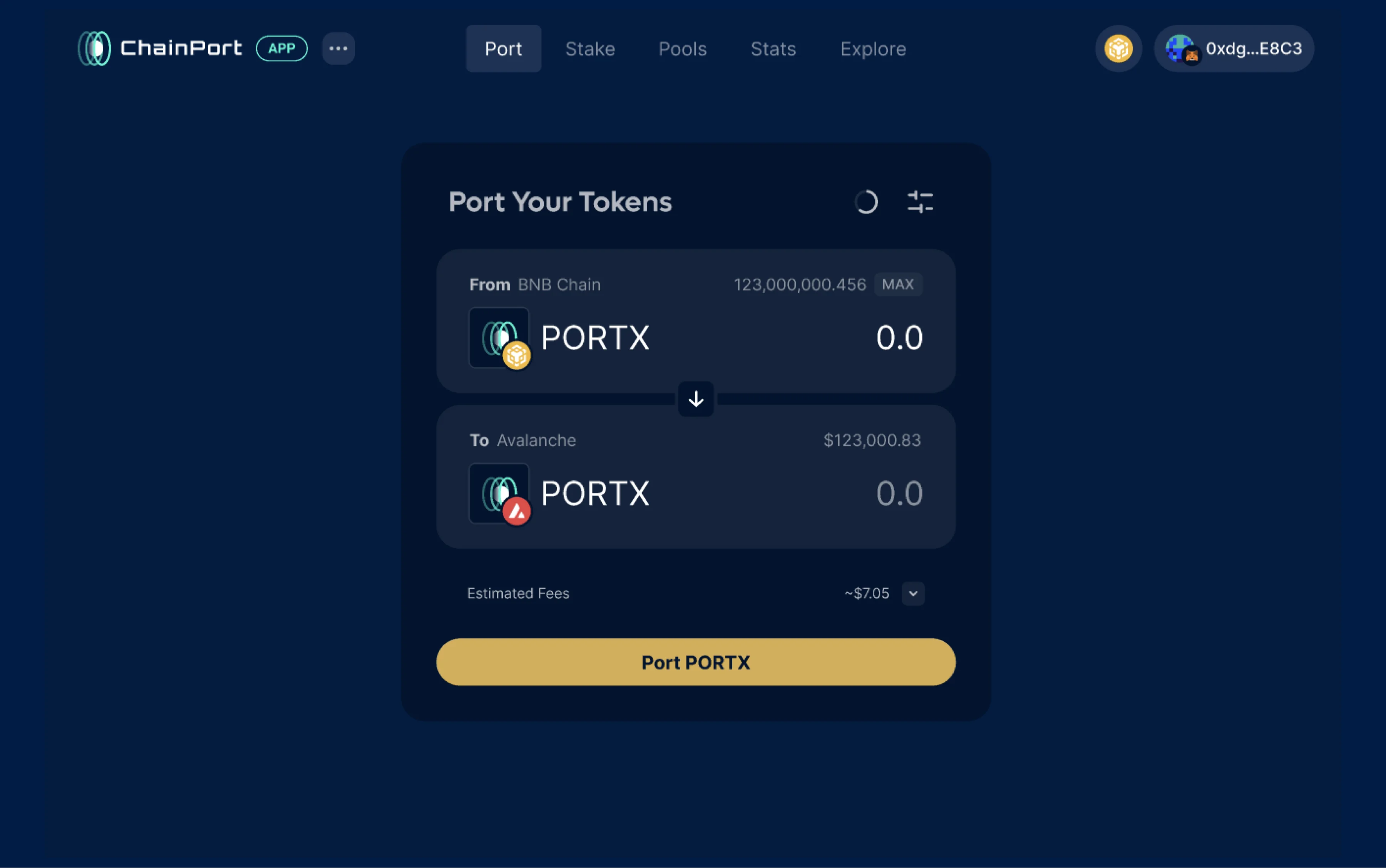
ChainPort is a Web3 bridge platform that enables users to securely transfer tokens across different blockchains, making cross-chain token transfers simple and secure.
Three years after the initial design, the ChainPort app required an update to meet new user needs and a refreshed look. New features led to challenges in maintaining the app within its previous structure, making it increasingly difficult and Inefficient to manage.
My Role: UI/UX Designer and Product Researcher.
Challenge: As we began supporting more bridging protocols, we had to implement adaptation in the UI. This caused difficulties with managing design updates, and frontend code as well. We realized it was the right time to align with industry standards and Simplify the interface to improve consistency.
Target Audience: A diverse mix of users, including both new and long-term users.
ChainPort audience ranges from small projects and to larger, more established projects.

Port container - legacy app
After analyzing the bridging market and identifying features that needed improvement or were missing, we set up key goals for the redesign:
Reduce Support Requests
Users were relying on support too often. Our goal was to reduce this by providing clearer guidance and additional information during the app's use.
Port in Parallel
Competitor bridges offer the ability to perform some transactions in parallel, which we aimed to implement in our redesign.
Asset Selection Confusion
The current app’s asset selection process was confusing for users. We wanted to make this interaction more intuitive.
Dark and Light Mode Switcher
Incorporating a dark/light mode toggle for better user accessibility.
.webp)
Visual inspiration - competitors analyze

Elements to be included in the new design:
Features to Improve
Generic port progress bar
Token selector new logic
Port container to support more cases
New Features to Support
Port in parallel
Data Refresh
App Messages during bridging
Dark and light mode switcher


Design System
Elements | Token selector input
The chosen design allows users to select both the chain and token simultaneously.
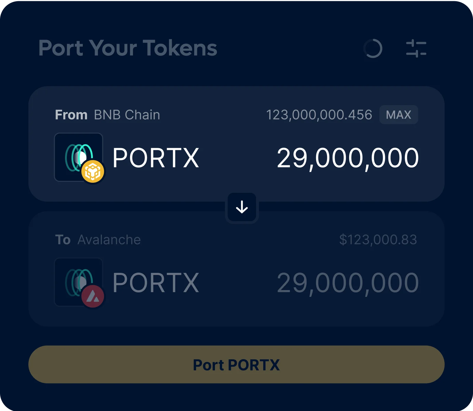
Asset selection input - final design
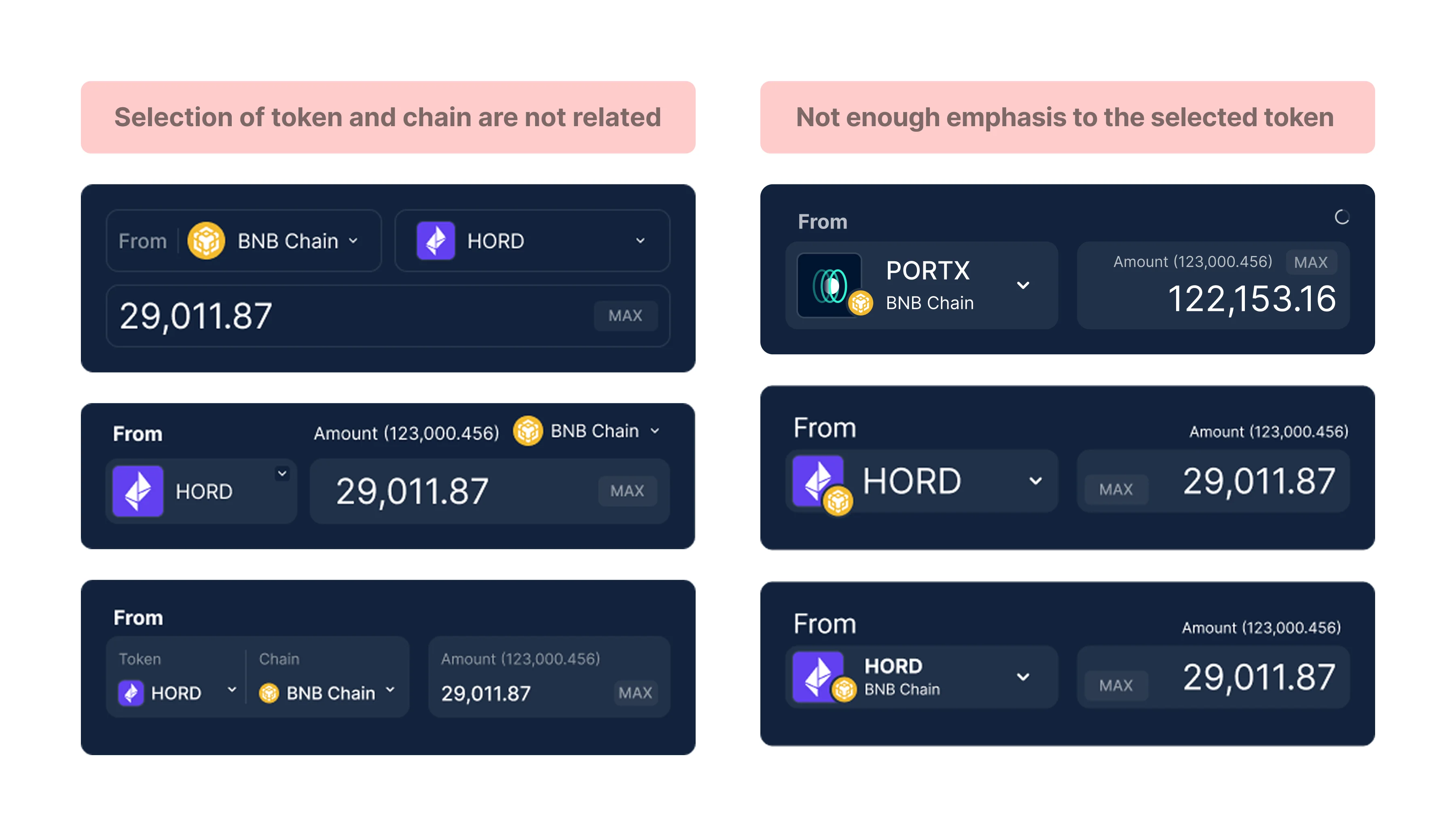
Asset selection input - discarded sketches


Rules System - Icons
Elements | Token selector list
Key logics:
The users makes two selections: Source and Target. They can start from whichever option they prefer.
The second selection displays the available options based on the first selection.
Users can navigate between blockchain, but on default see all of them.

Asset selector list

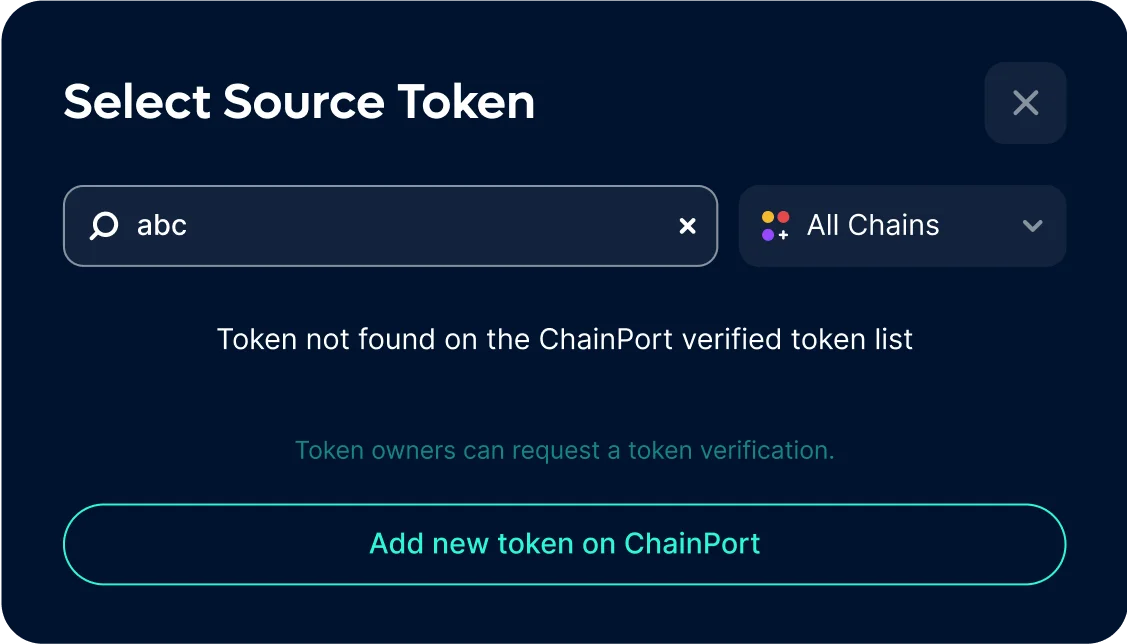
Asset selector list - search results
Elements | Port in parallel
Features include:
All port information organized into an activity log, allowing users to track progress while moving on to the next transaction.
A time estimator helps users remain patient and reduces the likelihood of support requests.
Clear status updates ensure users are always aware of the current stage of their transaction.
.webp)
Asset selector list - search results
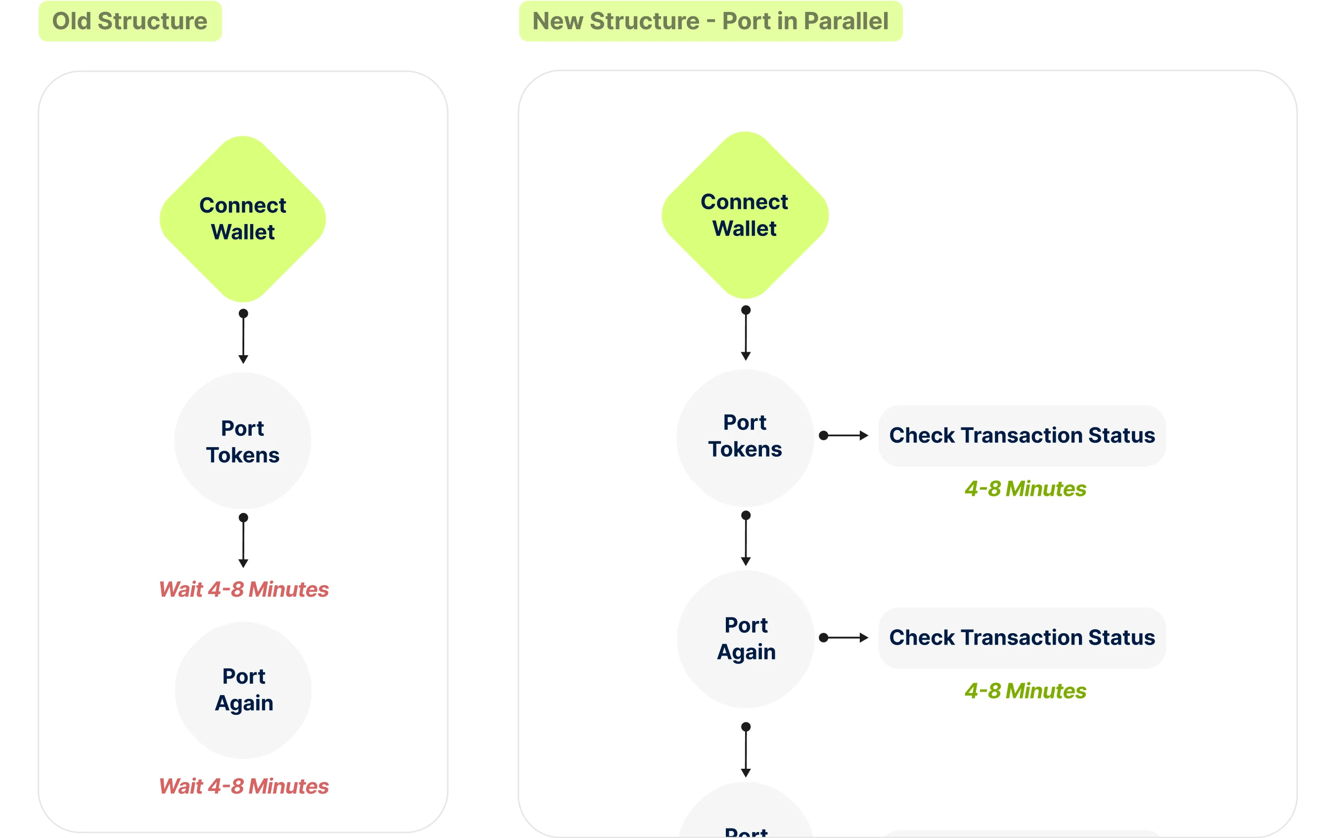
Port in parallel - Technical structure
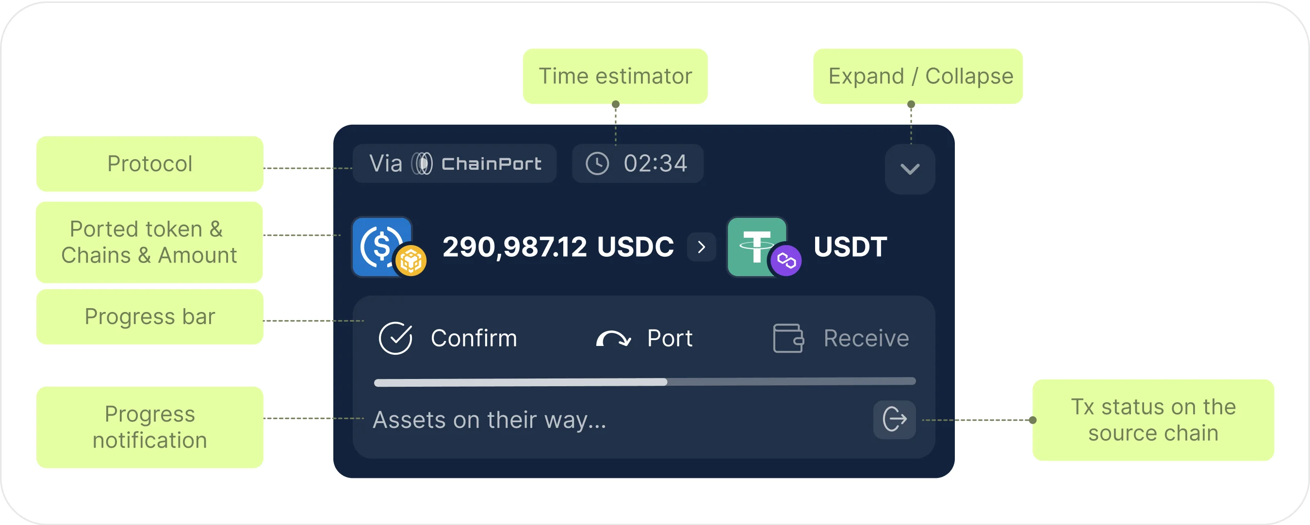
Port in parallel - card elements explained

Dark and Light Mode
An additional color mode designed to improve user accessibility and preferences.
.webp)
.webp)
Responsive | Mobile Design
ChainPort app users are nearly 50% mobile users, as most Web3 wallets are mobile-native apps that support browser-based applications. The biggest challenge was maintaining all essential functions without overwhelming the user experience on mobile devices.
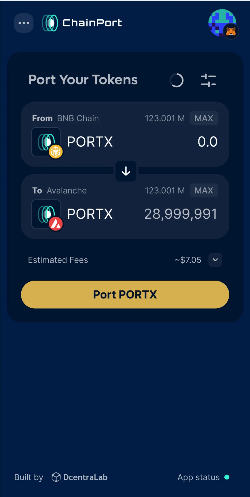
Mobile view
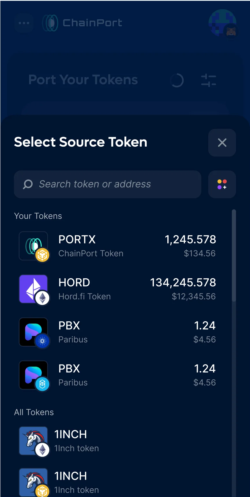
Asset selector

Port in parallel
In conclusion, this redesign tackled key challenges in usability, and user experience. We simplified the UI, added new features like parallel transactions, and improved core elements such as the token selector and progress bar. Features like the activity log and time estimator were introduced to reduce the need for support. The result is an efficient app that’s easy for both new and experienced users to navigate.
Explore my latest projects